Tagged With ‘nutmeg’
Etro
Greene Street
26 April, 2014
 The Italian fashion brand Etro made its name with a neo-hippy mix of paisley prints and clashing colours, so it’s no surprise that, among the 25-odd perfumes they’ve released since 1989, there’s the occasional whiff of patchouli and joss-sticks.
Their latest nod in that direction is Greene Street, launched in 2012 to coincide with the opening of their second Manhattan boutique on – you’ve guessed it – Greene Street in SoHo. According to Etro, ‘the western bohemian spirit is the heartbeat of the quarter’, though given that near neighbours include Chanel and Marc Jacobs, Etro’s idea of bohemian may be rather different from yours and mine.
As for the perfume, here’s what they say about it: ‘A symphony of spices create the perfect scent for the modern cosmopolitan man, for those who follow fashion but add their own unique touch of personality to every look. Versatile and distinctive, this perfume also magically adapts a more feminine tone when worn by a woman, thanks to the seductive subtle undertones.’
Got that? Personally I think it smells a bit like that old Body Shop hit from the 1980s, Dewberry, with its slightly choke-inducing mixture of spice and fruitiness. In Greene Street’s case, the scent ingredients include pepper (specifically the ‘pink pepper’ that, in the perfume world, has been so puzzlingly fashionable for the last few years), underpinned with nutmeg, violet and incense, among other things.
I’ve no idea which perfumer created Greene Street, though I see that a number of Etro’s previous fragrances were put together by the French perfume company Robertet; maybe one day we’ll be told, but there again they may be perfectly happy to remain anonymous.
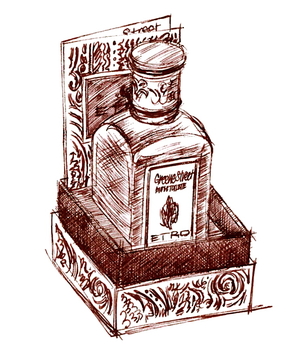
It’s not a horrible perfume, which instantly sets it above most of its competitors on department-store shelves around the world, but neither can I see it becoming one of my favourites. Which is a shame, as much as anything because I think that Greene Street is particularly well packaged and presented.
I haven’t, up to now, included packaging when I’ve illustrated a perfume, but I like this box so much, with its abstract paisley design on the outside and purple inner lining, that I think it’s worth a mention – not least because storing perfumes in their boxes is so much better for them than exposing them to light, and really well-designed packaging is a great encouragement on that front. So two cheers for retro Etro.